pyDataVis is a GUI application for interactive visualization, analysis and manipulation of scientific data. There are many free plotting software most of them far more powerful than pyDataVis. However, in terms of simplicity, it is hard to beat. Indeed it is very easy to use, just drag and drop your data file in pyDataVis window and immediately you are seeing the curves. For now, pyDataVis is limited to 2D plotting.
pyDataVis is an open source software written in Python. It uses PyQt as graphic user interface (GUI) and Matplotlib for plotting.
pyDataVis operates only on text data. These data are assumed to be in columns with the same number of elements. The column separator (a space, a tab character, a comma, a semicolon …) must be the same all over the file. Each column is regarded as a vector (one-dimensional array). Here is an example, with 3 vectors having 10 elements:
0   0.00    0.00
1   1.00    1.00
2   1.41    1.69
3   1.73    2.09
4   2.00    2.38
5   2.23    2.60
6   2.44    2.79
7   2.64    2.94
8   2.82    3.07
9   3.00    3.19
This set of data in tabular form is called a data block. It is possible to have several data blocks with different number of columns (vectors). These blocks must be separated by, at least, two empty lines.
Any line which contains non numeric data will be regarded as a comment. However, to prevent ambiguity, it is wiser to prefix a comment line with a ‘#’ character.
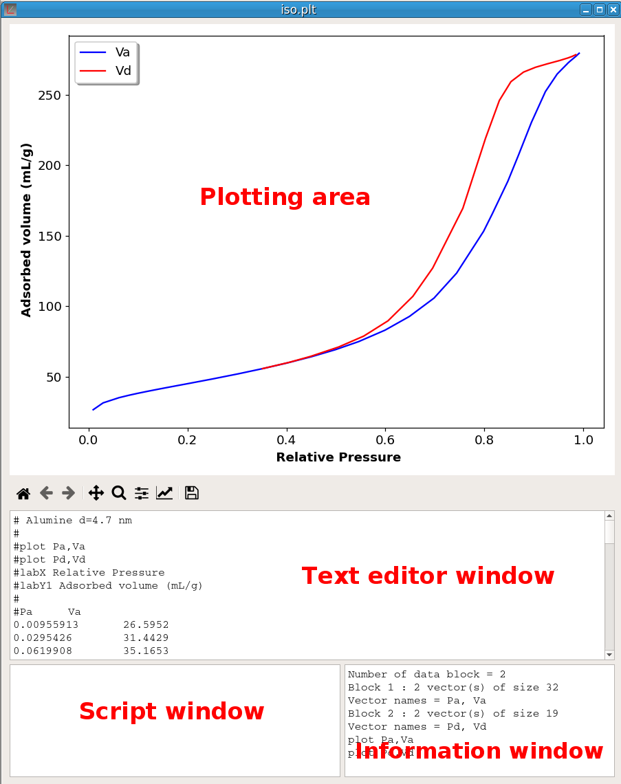
A pyDataVis window is shown in figure 1; it is divided into four main parts:
When a data file is red without error, the Text editor window shows the text content of the file. If the format of this text has been correctly decoded, one or more curves are automatically plotted in the Plotting area. Information about the structure of the data and plotted curves are given in the Information window. Unlike text editor and script windows the text in Information window cannot be modified, it is purely informational. The Script window is used to input the script commands.
This package can be found on the website of pyDataVis, in Downloads page. To install, assuming that the .deb file is in Downloads folder, open a Terminal and type:
cd Downloads
sudo dpkg -i pyDataVis.deb
The application files are in /opt/pyDataVis. To uninstall the application, you can use:
sudo dpkg --purge pyDataVisThis package archive can be found on the website of pyDataVis, in Downloads page. To install, copy the .zip file to the location where you want store the program. Then extract all files from the archive. To launch the application, open the folder pyDataVis and execute the file pyDataVis.exe.
To remove the application you only have to delete the pyDataVis folder.
Open a Terminal and run:
pip install pyDataVisThen to launch the application:
pyDataVispyDataVis requires Python 3, PyQt5, Numpy, Pandas, Scipy and Matplotlib. The easiest way to install everything is to use Open Source Anaconda that will “just work” out of the box for Windows, macOS and common Linux platforms.
The source archives can be found on the website of pyDataVis, in Downloads page. Extract the archive to the place where you want to store the program.
If you have git installed you can also clone the repository. Open a Terminal and change the current working directory to the location where you want to clone pyDataVis, for example ~/myprog:
cd ~/myprogThen type:
git clone https://github.com/pyDataVis/pyDataVis.gitTo launch the application, change the current working directory to the pyDataVis folder, for example ~/myprog/pyDataVis:
cd ~/myprog/pyDataVisand execute the pyDataVis.py script:
python pyDataVis.pyTo display the manual, open the page https://pydatavis.github.io/ in your browser or use the Help option in the Help menu.
The folder examples, in the source archives, contains files for testing almost any function. For those who have not installed from source archives, they can be found on the website of pyDataVis, in Downloads page.
If you need more information, feel free to contact me at: palphonse@wanadoo.fr
To see almost every script commands in action you can run the self tests with the ‘Run tests’ option in Help menu.
The text data is always loaded first in the Text editor window before been processed. Then pyDataVis tries to decode the data. If successfull it will plot the curves. There are two ways to supply data in the Text editor window:
The usual way is to load the data from a file. This is done either by selecting Open in the File menu or by dragging the file, from the file manager or the desktop, in the pyDataVis window.
The second way is to enter the data manually. For example, using the key sequence Ctrl+N (or selecting New in the File menu) opens a new empty pyDataVis window. You may then input the data in the Text editor window. It is also possible to paste text data from an other application. Translation of this data in vectors and plotting the resulting curves is done by selecting Update from text in File menu.
pyDataVis can automatically decode and plot the files containing IR, mass or NMR spectra in JCAMP-DX format. This format is used for example in NIST Chemistry WebBook or ChemSpider databases. pyDataVis also recognizes the Raman data file format from the RRUFF database.
The Append option in the File menu is used to append data from another file at the end of the current data. The added file must contain only one data block and the number of vectors must be the same as the current data block.
By using the option Import from spreadsheet in the File menu, it is possible to import data from spreadsheet files like MS Excel or LibreOffice Calc (in this case the odfpy module must first be installed, for example with pip install odfpy). If the file contains several sheets, the same number of data blocks are created. Each sheet must contains only one data table otherwise the importation will give unpredictable results.
When the vectors are modified, for example by Script commands, the Text editor window is not updated to reflect these changes. In case of mistake this gives the possibility to restore the previous state by using the Update from text option in the File menu. To update the Text editor window with the current vector values the Update from data option in the File menu should be used. Beware that these two options update also the file so that there is no way to get the original data back.
To see the real-time values of the vector elements, use the Data Table option in the Tools menu. This table can also be displayed with the key sequence Ctrl+T. The position of the selected cell of this table is linked to the data cursor position. The value of the vector elements can also be modified with this table.
The data blocks can be saved in text files by using the options Save data and Save data As in the File menu. The column separator is always a tab character. The data blocks are separated from each other by two successive empty lines. Save data uses the current file name whereas Save data As lets you choose a new file name. I recommend to use the “.plt” extension for files saved by pyDataVis to tell them apart from simple .txt files because they contains plotting commands in the header.
There are three options in the File menu to export the data blocks:
Non numeric lines are generally regarded as comments and are not decoded except if they start with special words like plot, labX, … in which case they are interpreted as plot commands. Besides, the line immediately before the numerical data is decoded to check if it contains the vector names. For example:
Time Intensity
0     0
1     5
2     15
3     30
The first vector [0,1,2,3] will be named Time and the second one [0,5,15,30] Intensity.
The number of items in the line containing the vector names must match the number of columns. Therefore a vector name cannot contains space because the space character is regarded as a separator (underscore can be used instead).
In the absence of a line containing the vector names, the vectors are named automatically as V1B1, V2B1, … where the B1 ending indicates that these vectors belong to the first data block. Thus if the file contains a second data block the vectors belonging to this block will be named V1B2, V2B2, …
If no plot command is found in the file header, the first column (V1B1) is assumed to contain X values. Thus, if the file contains three columns (vectors), V1B1, V2B1 and V3B1, two curves will be automatically plotted, V2B1 against V1B1 and V3B2 against V1B1.
Several pyDataVis windows can be opened at the same time and curves exchanged between them using the options of the Curve menu or keyboard shortcuts.
A curve consists of a set of two vectors (X and Y). Thanks to the Curves menu, the curves can be deleted, duplicated or copied. A curve copied in a pyDataVis window cannot be pasted in the same window because two curves cannot share the same name. If the curve is pasted in a window containing a vector having the same name, the original name is suffixed with the ’‘#’’ character. It is the same when a curve is duplicated,
When a X,Y curve is pasted into another window, if the same X-vector already exists in a data block, there are two possibilities, either to add the Y-vector at the end of the data block or to create a new data block to store the X and Y vectors. This is left to the user’s choice.
The Save in file option allows for saving a given curve in a new file.
When a curve is displayed on plotting area, right clicking with the mouse in this area triggers a light brown crosshair cursor. The point number (no) and coordinates (xc, yc) at the cursor position are shown in the status bar at the bottom of the pyDataVis window.
This cursor can be moved to the next data point either with the key sequence Ctrl+Right arrow or by selecting the option Cursor Right in the Marks menu. Similarly the cursor can be moved to the previous data point either with the key sequence Ctrl+Left arrow or by selecting the option Cursor Left in the Marks menu.
Besides, the key sequence Ctrl+F (Cursor First in the Marks menu) puts the cursor on the first point while the key sequence Ctrl+L (Cursor Last in the Marks menu) puts the cursor on the last point.
When the plotting area shows several data curves, the cursor follows only one curve, which coordinates are shown in the status bar. This is the “active” curve. The key sequence Ctrl+D (Cursor Down in the Marks menu) makes the previous curve to become the active one whereas the key sequence Ctrl+U (Cursor Up in the Marks menu) makes the previous curve to become the active one.
Finally, the key sequence Ctrl+M (Add a Mark in the Marks menu) adds or moves a mark (shown as a gray vertical line) at the cursor position. Only two marks can be added because the third time Ctrl+M is hit, the first mark is deleted and replaced by the new one. The key sequence Ctrl+R (Remove all Marks in the Marks menu) remove cursor and marks. These marks are used to select portions of the curve for several script commands.
Beneath the Plotting area there is the MatPlotLib toolbar shown in figure 2. Hovering the mouse over each icon displays a tool tip giving a short description of its action. Here is the description of the action of each button:
The first three buttons, Home, Back/Forward, are used to navigate through the previous views. Home returns to the initial view of the plot.
The fourth button has two modes: pan and zoom. Press the left mouse button and hold it to pan the figure. If you press ‘x’ or ‘y’ while panning the motion will be constrained to the x or y axis, respectively. Press the right mouse button to zoom, dragging it to a new position. The x axis will be zoomed in proportionately to the rightward movement and zoomed out proportionately to the leftward movement. The same is true for the y axis and up/down motions.
The fifth button handles zooming to rectangle functions. Dragging the mouse while holding the left button the axes view limits will be zoomed in to the defined region. When using the right mouse button, the axes view limits will be zoomed out, placing the original axes in the defined region.
The sixth button is used to adjust the plot position within the window.
The seventh button calls the axis/curve style editor, where you can modify most of the plot properties like title, axis label and scale, plot symbols, line colours and line styles. It should be noted that the changes done using the axis/curve style editor are not recorded permanently.
The last button allows to save the plot as an image. You can save files with the following extensions: png, ps, eps, svg and pdf.
| Command | Keyboard shortcut |
|---|---|
| Toggle grid | g or G when mouse is over the plot |
| Toggle x axis scale (log/linear) | L or k when mouse is over the plot |
| Toggle y axis scale (log/linear) | l when mouse is over the plot |
| Constrain pan/zoom to x axis | hold x when panning/zooming with mouse |
| Constrain pan/zoom to y axis | hold y when panning/zooming with mouse |
| Preserve aspect ratio | hold CONTROL when panning/zooming with mouse |
The toggle grid shortcut g (or G) behavior is: the first hit toogles vertical grid, the second hit adds the horizontal grid, the third hit removes the vertical grid leaving only the horizontal one and the fourth hit removes all grids.
When the data format cannot be decoded, no curve is shown in the Plotting area, only the text content is displayed in the Text editor window. Nevertheless, in some cases, the data in the Text editor window can be processed by selecting the suitable option in the Convert menu.
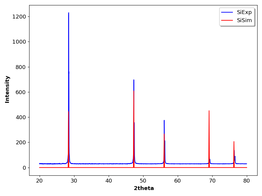
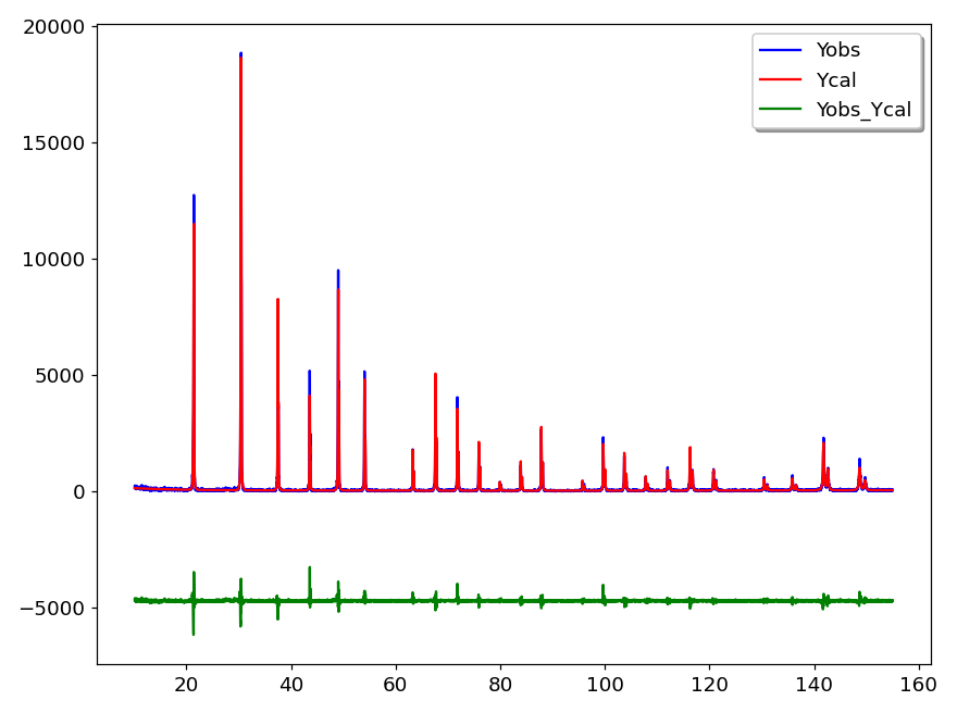
The CIF option is used to generate a powder diffraction pattern from a Crystallographic Information File (CIF). This is a standard text file format for representing crystallographic information, promulgated by the International Union of Crystallography (IUCr). A large collection of CIF files can be found in the Crystallography Open Database (COD).
The reflection lines in the simulated XRD pattern are generated from CIF data loaded in the Text editor window by the Dans_Diffraction package. This package is easily installed in aterminal with: pip install Dans-Diffraction.
The line positions are calculated for an X-ray energy = 8.048 keV, which corresponds to Cu K-alpha-1 radiation. For example, the figure 3 shows the simulated pattern of silicon calculated from a CIF file (COD 9008566) plotted along with an experimental pattern recorded with a silicon standard.
The DAT option does the conversion of “.DAT” diffraction file format. This is a common ASCII file format for raw (profile) data. In the first line, the 2theta start, step and final value are given, followed by the intensity values for each step. The number of intensity values per line may vary. The generated data is saved in a new file using the same name as the “.DAT” file but with “.TXT” extension. Then this file is loaded and plotted in a new pyDataVis window.
The PRF option does the conversion of a “.prf” file generated by FullProf in a tabular text file. FullProf is a set of programs used for Rietveld analysis of X-ray powder diffraction data. The generated data is saved in a new file using the same name as the “.PRF” file but with “.TXT” extension. Then this file is loaded and plotted as shown in figure 4.
The Reshape option allows to change the shape of a data block (number of lines and columns) while keeping the total number of elements constant. For example, Reshape can transform 1D data in 2D with half the number of elements in each dimension. It can be used to restore the right shape which has been lost after pasting the data from another application. For example, when a set of cells are pasted from LibreOffice Calc the column separator seems to have vanished. By using the Update from text option in the File menu, the data are now in one column. With the Reshape option it is possible to restore the original shape of the data.
The Transpose option switches the rows and columns. Like Reshape, it can be used to restore the right shape which has been lost after pasting the data from another application.
The 1D->2D option adds to a data block containing only one vector, let’s call it Y, a new vector X thereby allowing to plot Y=f(X). The X vector contains the point number, starting from 0. Subsequently it is easy to modify X thanks to script commands.
In pyDataVis, most of the data processing is done via scripting commands which are detailed below. However in some cases it is more convenient to use interactive tools. These tools are accessed via the Tools menu. When several curves are plotted in the Plotting area, a dialog let you select the curve that need to be addressed.
In some cases the computation results are saved in the log file preceded by a header indicating the date and time of the calculation. This file can be accessed and modified by selecting the View log option in the file menu.
Smoothing is a very powerful technique used all across data analysis. It consists of removing random variation (noise) while preserving the original shape and features of the signal. With pyDataVis you can choose several techniques to achieve the best result according to the kind of data.
With the Smoothing option of the Tools menu two kinds of filter are proposed: the Moving average and the Savitzky-Golay.
The Moving average filter operates by averaging ‘n’ points from the input data to produce each point in the output data, where n is an odd integer. The figure 5 shows the smoothing window when the Moving average filter is selected. Three curves are plotted. The grey curve corresponds to the original data, the blue curve to the filtered data and the green curve shows the difference between original and filtered. The goal is that this curve shows only noise.
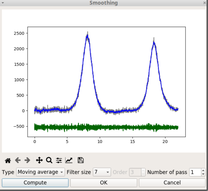
There are two parameters to tune the degree of smoothing. The first is the filter size, which is the number of points that are averaged. The second is the number of passes which is the number of times the filtering process is repeated. When the parameter values are changed, you should click on the Compute button to restart the calculations with the new values.
When you click on the OK button, the original data is replaced by the blue curve, the window is closed and the Plotting area is updated.
The Savitzky-Golay is a low-pass filter, particularly suited for smoothing noisy data. The main idea behind this approach is to make for each point a least-square fit with a polynomial of low order over an odd-sized window centered at the point. It has the advantage of preserving the original shape and features of the signal better than other types of filtering approaches, such as moving average.
When the Savitzky-Golay filter is selected, there is an additional parameter, the order, which is the degree of the fitting polynom.
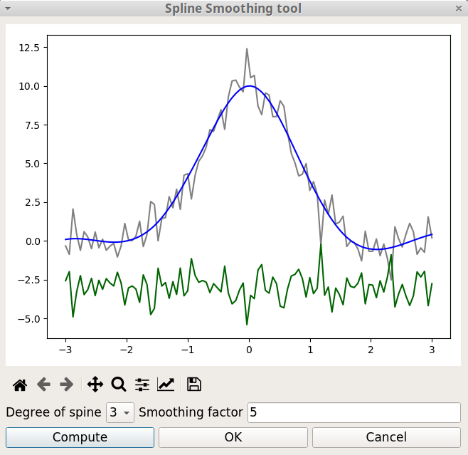
Spline functions are widely used in applications requiring data interpolation and/or smoothing. They are build by defining knot points and calculating the polynomials that pass through these points. With the Spline Smoothing option of the Tools menu two parameters are used to tune the level of smoothing:
The degree of the polynomials. Must be in the range 1 to 5. The best starting value is 3, which corresponds to a cubic spline.
The smoothing factor, s, which is used to choose the number of knots. This factor control the trade-off between fidelity to the data and roughness of the function estimate. If s = 0, spline will interpolate through all data points.
The figure 6 shows the Spline smoothing window. Like with the Smoothing window seen above, three curves are plotted. The grey curve corresponds to the experimental data, the blue curve to the smoothed data and the green curve to the difference between experimental and smoothed values.
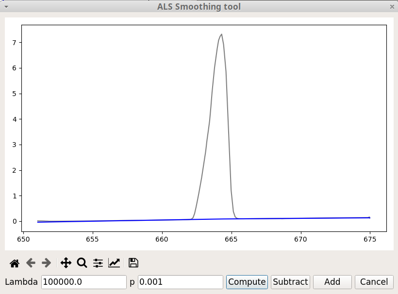
The ALS Smoothing option, in the Tools menu, is primarily used for baseline correction. ALS stands for Asymmetric Least Squares. This method has been designed by Paul Eilers and Hans F.M. Boelens (2005). To get an effective baseline estimator, it combines a smoother with asymmetric weighting of deviations from the (smooth) trend. It is easy to use, fast and keeps the analytical peak signal intact. No prior information about peak shapes or baseline (polynomial) is needed.
There are two parameters: p for asymmetry and lambda for smoothness. For a signal with positive peaks a good choice is to set lambda between 102 and 109 and p between 0.001 and 0.1.
It is not efficient for a number of data point exceeding 1000.
The figure 7 shows the ALS Smoothing window. Besides the Compute button already present in the previous tools, there are two additional buttons. As we might expect Subtract will subtract the baseline and thus change the original data, whereas Add does not change the data but add a new vector containing the baseline.
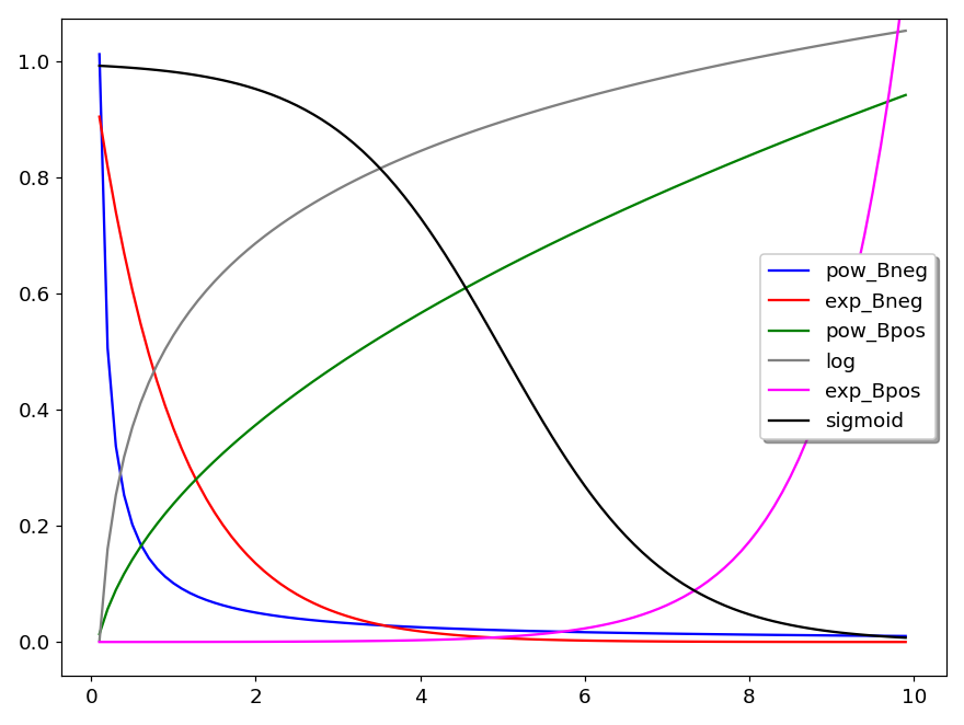
The Curve Fitting option, in the Tools menu, is used for fitting curves with predefined models. There are seven models :
Polynomial
Exponential, \(y = A \times exp(B x)\)
Logarithm, \(y = A \times Ln(x) + B\)
Power, \(y = A \times x^B\)
Sigmoid, \(y = y_0 + \frac{H}{1 + exp(S (x_0 - x))}\)
Arrhenius, \(y = A \times exp \left( - \frac{E}{R(x+T)} \right)\) with R = 8.314 and T = 273
Herschel-Bulkley, \(y = A + B x^C\)
Several curves are plotted in figure 8 to show the general shape of these models. In the plot legend, Bneg means that B is negative and Bpos that B is positive. Thus pow_Bneg reads as power model with negative B.
In the equation of the sigmoid model, \(x_0\) is the position of the inflection point, \(y_0\) is the position of the baseline, H is the height (amplitude) and S governs the slope of the tangent at the inflection point. Larger S values means steeper increase. When S is negative the S shape is inverted. For example, in figure 8, S = -1 and in figure 9, S = +1.
The last two models are more specific. The Arrhenius model describes the temperature dependence of reaction rates. The parameters are A (which is called the pre-exponential factor) and E the activation energy.
The Herschel-Bulkley model is used to describe the rheological behavior of a non-newtonian fluid; y is the shear stress and x the shear rate; A is the yield stress, B the consistency index and C the flow index.
None of the available models in Curve Fitting menu option are adequate for fitting peaks. For that, the Peak fitting tool should be used.
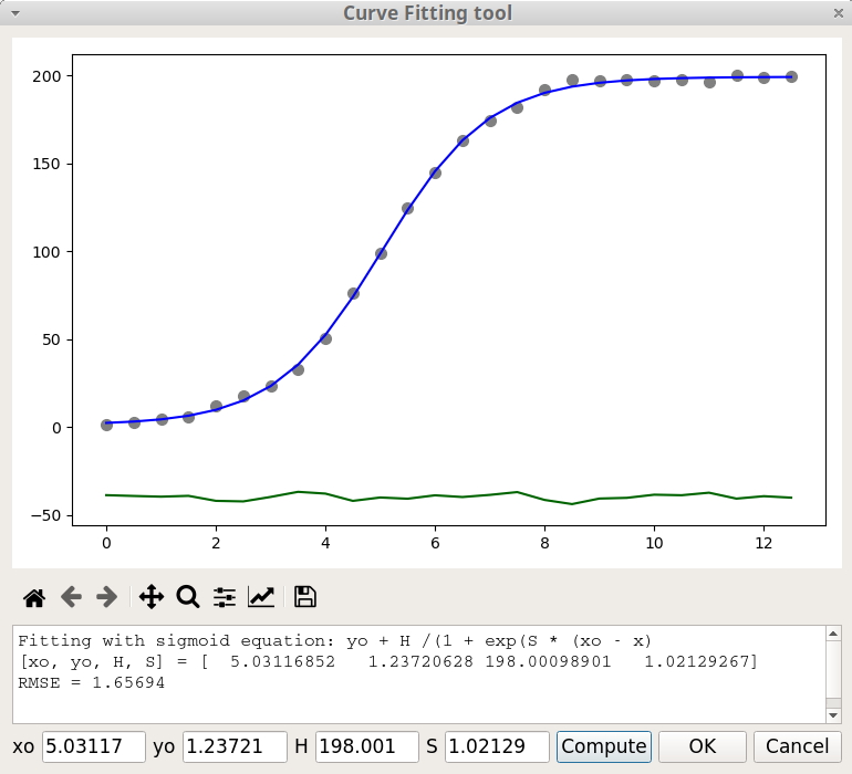
The figure 9 shows the Curve Fitting window after a fitting process with the Sigmoid model. The current parameter values are printed in the text area, below the Matplotlib graphic toolbar. The value of these parameters can be modified in the fields at the bottom of the window and the fitting process is restarted by clicking on the Compute button. An estimation of the goodness of the fit is given through the Root Mean Square Error (RMSE) value defined by:
\[ RMSE = \sqrt \frac {\sum_{i=1}^{N} { \left[ y_{calc} - y_{exp} \right] ^2 } } {N} \]
where \(y_{calc}\) is the calculated data, \(y_{exp}\) the experimental data and N the number of points. The fitting results are saved in the log file.
When you click on the OK button, the original data is replaced by the blue curve, the window is closed and the Plotting area is updated.
These two options of Tools menu are working together because after finding the peaks, the Peak finding module automatically calls the Peak fitting module. It should be noticed that this module requires that the baseline is at zero. You can use the Baseline correction tool if this not the case.
Selecting the Peak finding option pops up the Peak finding dialog as shown on figure 10. To select only the relevant peaks, two parameters are used: the height of the smallest peak (minHeight) and the width of the narrowest peak (minWidth).
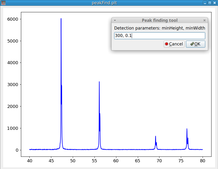
The first time, pyDataVis try to guess the parameter values based on a statistic analysis of the signal. Of course, you can modify these values according to your expectations.
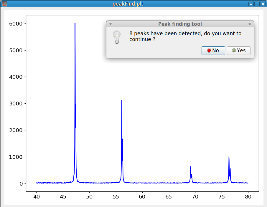
As shown on figure 11, at the end of the peak finding process, a dialog pops up to inform you of the number of peaks that were found. If you answer ‘Yes’ the peak fitting module is launched. Otherwise the process is canceled.
When the peak fitting process is finished (which can takes some time when there are many peaks) the peak fitting window pops up, as shown in figure 12. This window is divided in three parts. Above is the plotting area which allows to visually evaluate the fitting results. The grey curve corresponds to the experimental data, the blue curve to the calculated sum of the peaks and the green curve shows the difference between the data and the peak sum. Of course the goal is to make this curve as flat as possible.
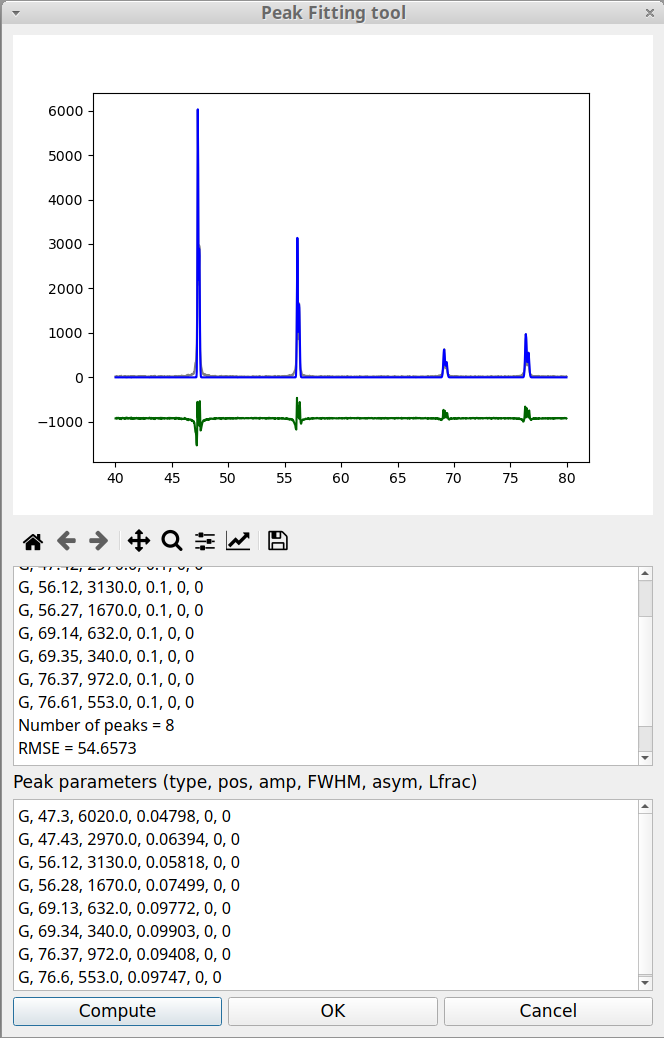
Below the plotting area, there is the information area (read only). As in the case of Curve fitting an estimation of the goodness of the fit is given through the RMSE value, already defined above in the Curve fitting tool. Below the information area is the Peak parameters area. Here, the value of the peak parameters can be modified after which the fitting process can be launched again by clicking on the Compute button. The fitting results are saved in the log file.
When the fitting module is called from the Finding peak option, it always uses a Gaussian function to model each peak shape. The Gaussian type is not the best to represent the peak shapes in the case of the experimental data shown in the previous figure. It is possible to change the peak model by replacing the peak parameters, G, by another type. pyDataVis allows to choose between six peak types:
The curve equation for Gaussian and Lorentzian peak type are: \[ G(x) = A \times exp \left[- \left( \frac{x-x_m}{w} \right) ^2 \right] \]
\[ L(x) = A \times \left[ \frac{1}{1 + \left( \frac{x - x_m}{w/2} \right) ^2} \right] \]
In these equations, A is the peak amplitude (height), \(x_m\) is the position of the peak maximum, w is the Full Width at Half Maximum (FWHM). The pseudo-Voigt model P(x) is a linear combination of a Gaussian curve G(x) and a Lorentzian curve L(x). Therefore this model requires an additional parameter m.
\[ P(x) = m \times L(x) + (1-m) \times G(x) \qquad with \; 0 \leq m \leq 1 \]
The peak shape, associated with these three models, is shown in the left plot of figure 13. The three remaining peak types are used to fit asymmetric peaks. In this case the w parameter is no more a constant but becomes a function of x, w(x) defined by:
\[ w(x) = \frac{2 \ FWHM}{1 + exp(a(x - x_m))} \qquad with \ -1 \leq a \leq 1 \]
The parameter a is the skewness factor. The equation of AG(x), AL(x) and AP(x) are obtained by replacing w by w(x) in the above equations of G(x), L(x) and AP(x). The peak shape corresponding to these three models is shown in the right plot of figure 13.
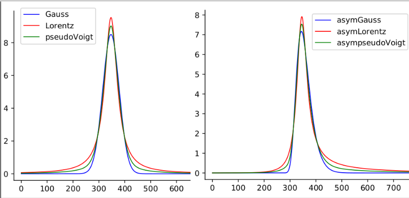
It is important to notice that, in the peak parameter area, for each peak, six parameters are always provided even when they are not relevant, in which case they are set to zero. The extra parameters are m, the mixing parameter for pseudo-Voigt model and a the skewness factor for asymmetric models.
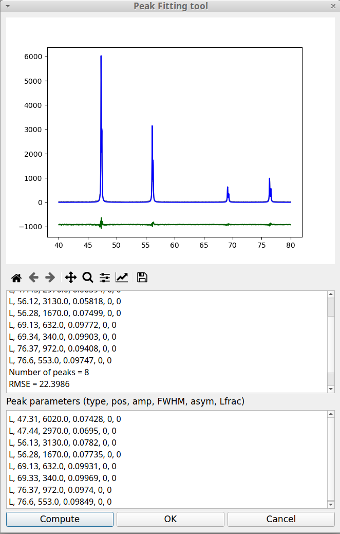
Let us return to the peak fitting window and replace, for both peaks, the peak type parameter, G, by L. We do not modify the other parameters and click on Compute button. The figure 14 shows that this improves the fitting result.
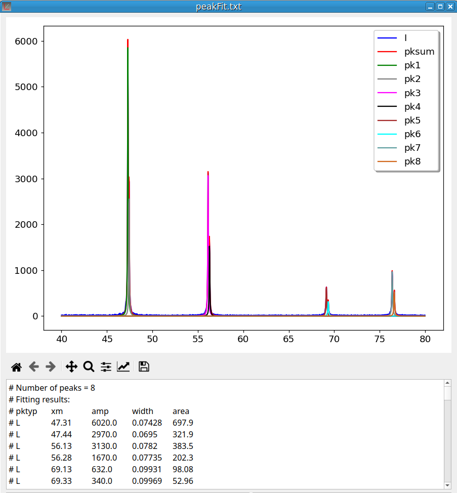
Clicking on OK generates a file named “peakFit.txt” and opens a new pyDataVis window to display its content. The plotting area is shown in figure 15. There are 10 curves: the experimental data, the sum of peaks and the curve for each peak.
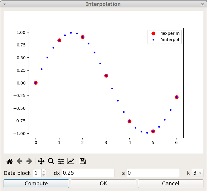
Interpolation consists of finding intermediate values of a variable from a discrete set of its known values. For example, a spatial interpolation or temporal interpolation can be used for finding missing data in space- or time-series. pyDataVis use a smooth spline curve approximation to determine the positions of the unknown values. The Interpolation window, shown on figure 16, is accessed thanks to the Interpolation option of the Tools menu. There are three parameters:
It is possible to interpolate curves which are in another data block by selecting the corresponding block number.
It should be noticed that this tool can also be used to decrease the number of data points.
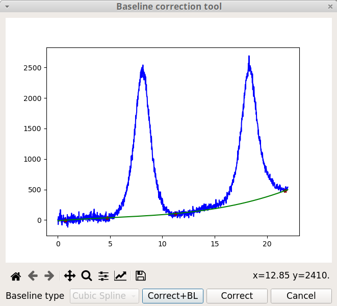
The Baseline correction is ubiquitous for spectroscopic data analysis because a spectrometer usually have a baseline drift due to environmental factors (temperature, light source, …). The Baseline correction tool of pyDataVis, shown on figure 17, is accessed thanks to the Baseline option of the Tools menu. You define the baseline position by clicking on the curve. Left click adds a new point at the mouse position, right click deletes the point which was already around. The baseline curve can be build from these points by two methods according to the type:
Once a method is chosen, it is not possible to change it. If you click on Correct button the baseline is subtracted from the original data. If you click on Add BL button, this does not change the data but a new vector containing the baseline is added to the data block.
If the signal is too noisy it is recommended to remove the noise prior to the baseline correction (see Remove noise tool).
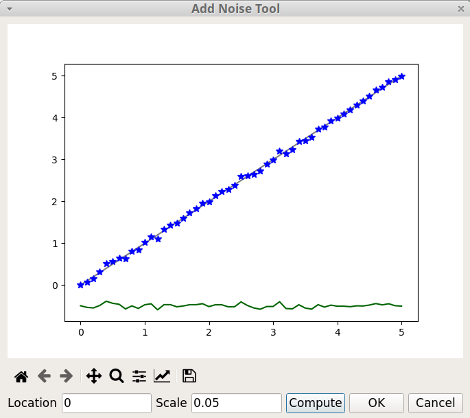
The Add Noise tool of pyDataVis, shown on figure 18, is accessed thanks to the Add Noise option of the Tools menu. This tool adds to the selected curve random values calculated from a normal (Gaussian) distribution. There are two parameters:
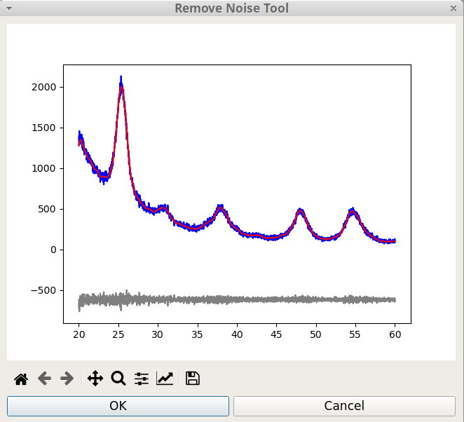
The Remove Noise tool of pyDataVis, shown on figure 19, is accessed thanks to the Remove Noise option of the Tools menu. Actually this tool is not interactive because the process is fully automatic.
In pyDataVis, script commands are used for plotting and to do most of the data processing. Beware that the command names, the vector names and the parameters are case sensitive. Several script commands can be chained together. The script commands are written in the Script window and executed by typing Ctrl+E or by selecting the option Execute a script in the Script menu. Empty lines and lines starting with # are ignored during execution. The script can be executed repeatedly by retyping Ctrl+E as often as desired. If an error occurs during the execution of a script sequence, the process is stopped at the faulty line; the remaining commands are not executed.
Before a script was executed, the current data is saved in memory. If something wrong happens during execution the previous state can be restored by selecting the Undo option in the Script menu.
The key sequence Ctrl+K clears the text in the Script window and gives it the focus so a new script can be written without having to click in this window.
It is possible to save the content of the Script window to a file by selecting the option Save script in the Script menu. Conversely a script previously saved to a file can be loaded in the Script window by selecting the option Load script. The figure 20 shows a pyDataVis window after creation of a new file and execution of the following script:
newv X 0,6.3,0.1
Y = X + sin(2*X)
plot X,Y
labX X
labY1 Y
text 0.5,5,Y = X + sin(2X),black,20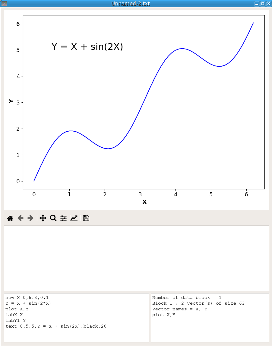
The command used to plot the vector Y against the vector X is:
plot X,Y
plot X,Y,2
The first command plots Y against X using the primary Y-axis (left side) whereas the second command plots Y against X using a secondary Y-axis (right). Only one secondary axis is possible and a plot command against primary axis must precede a plot command against the secondary. Both X and Y vectors must belong to the same data block. The color of the curves is chosen automatically but it can be temporarily modified with the axis/curve style editor in Matplotlib toolbar.
The following command gives to the x-axis the label “Time (s)”
labX Time (s)The following commands give to the primary Y-axis the label “Intensity” and to the secondary Y-axis the label “Volume”
labY1 Intensity
labY2 Volume
Default plot type is line, that is no symbol are drawn for data points which are linked by lines segments. Symbols are automatically used if the number of points is lower than 15. However it is possible to change this behavior with the commands:
symbol Y
no symbol Y
The first will plot symbols for the curve Y whereas the second will use line type. Like the color, the symbol shape is chosen automatically, however it can be temporarily modified with the axis/curve style editor in Matplotlib toolbar.
You can flip the order of the axis limits thanks to the following commands:
invertx
inverty
These commands works like switches. They are not saved when the file is closed.
It is possible to add text. The following command writes ‘Title’ at x,y position, using a red font with size 14:
text x,y,Title,red,14The text position is relative to x-axis and primary y-axis. The fourth parameter ‘red’ indicates that the text color is red. The color names are:
blue, darkblue, red, darkred, green, darkgreen, magenta, darkmagenta, cyan, darkcyan, yellow, brown, gray, black, white, cadetblue, chocolate, coral, burlywood, aqua, aquamarine, blueviolet, cornflowerblue, crimson, darkgoldenrod, darkkhaki, darkolivegreen, darkorange, darksalmon, darkseagreen, darkslateblue, darkslategray, darkviolet, deeppink, goldenrod, greenyellow, hotpink, indigo.
Finally it is also possible to add an arrow. The following command draws a red arrow which starts at x,y; its length and angle are given by dx and dy. If dx=0, the arrow is parallel to y-axis. If dy=0 it is parallel to x-axis. If dx=dy it makes an angle of 45°.
arrow x,y,dx,dy,redAll these commands can be chained together. For example, the plot in figure 21 was obtained by executing the following lines in the Script window:
plot T,TG
plot T,Hf,2
labX Temperature (C)
labY1 TG (%)
labY2 Hf
arrow 850,-25,0,7,red
text 815,-28,exo,red,18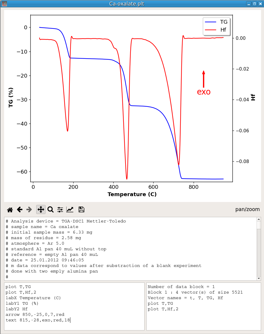
The name command is used to change the name of a vector. For example the following command gives to the vector V1 the name V2. It is not possible that two vectors share the same name, therefore if V2 already exists this command will generate an error.
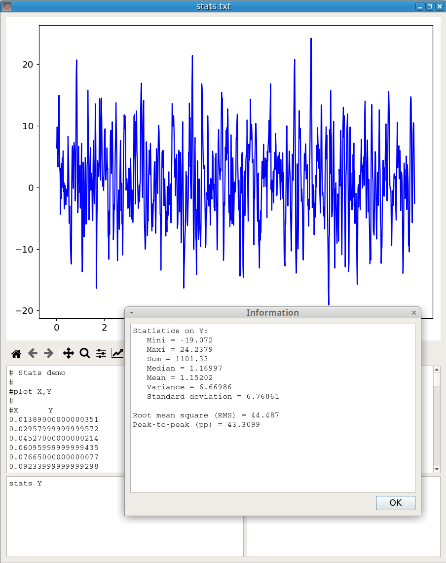
name V1 as V2The stats command provides statistics on a vector:
stats V1As shown in figure 22, for a vector Y {\(y_1\), \(y_2\),…,\(y_n\)} of dimension n, the values returned are:
Minimum, \(y_{min}\)
Maximum, \(y_{max}\)
Sum of the values, \(S = \sum_{i=1}^{n} y_i\)
Median, which is a value separating the higher half from the lower half of Y.
Arithmetic mean, \(\overline{\rm y} = \frac{S}{n}\)
Variance, \(\sigma^2 = \frac{1}{n-1} \sum_{i=1}^{n} \left(y_i - \overline{\rm y} \right)^2\)
Standard deviation, \(\sigma = \sqrt{\sigma^2}\)
Root mean square, \(RMS = \sqrt{\frac{1}{n} \sum_{i=1}^{n} y_i^2 }\)
Peak-to-peak, pp = \(y_{max} - y_{min}\)
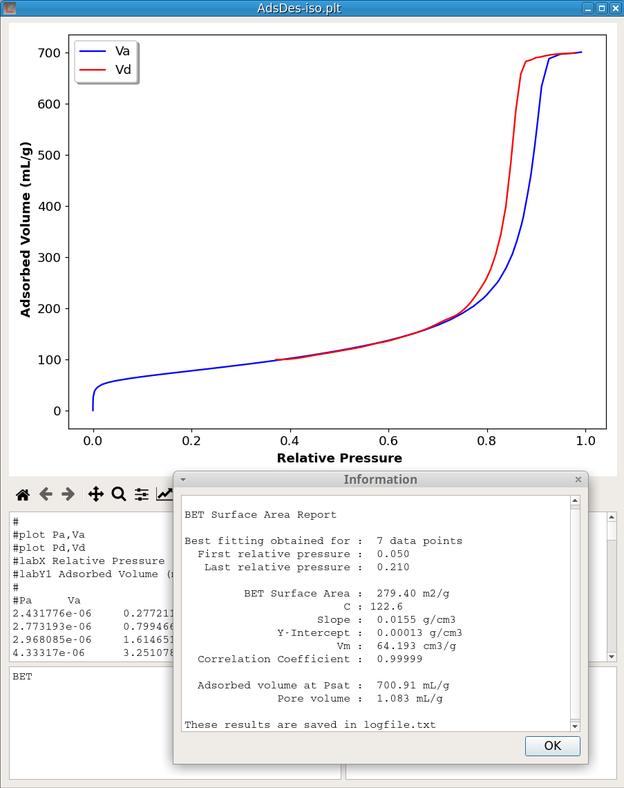
Brunauer–Emmett–Teller (BET) model serves as the basis for the measurement of the specific surface area of materials from adsorption isotherms. The BET command:
BETcomputes the optimum BET surface area and the BET constant. No parameter is given because it is assumed that the first data block contains the adsorption isotherm with the first vector of this block being the relative pressure and the second vector the adsorbed volume expressed in mL/g. Only nitrogen adsorption is implemented. If the relative pressure reaches the saturation (Pr > 0.98) the BET command computes also the pore volume. The optimisation process includes finding, in the relative pressure range 0.04 - 0.30, a window of at least seven data points, giving the best correlation coefficient. The figure 23 shows an example of the computation results. More detailed information is saved in the log file.
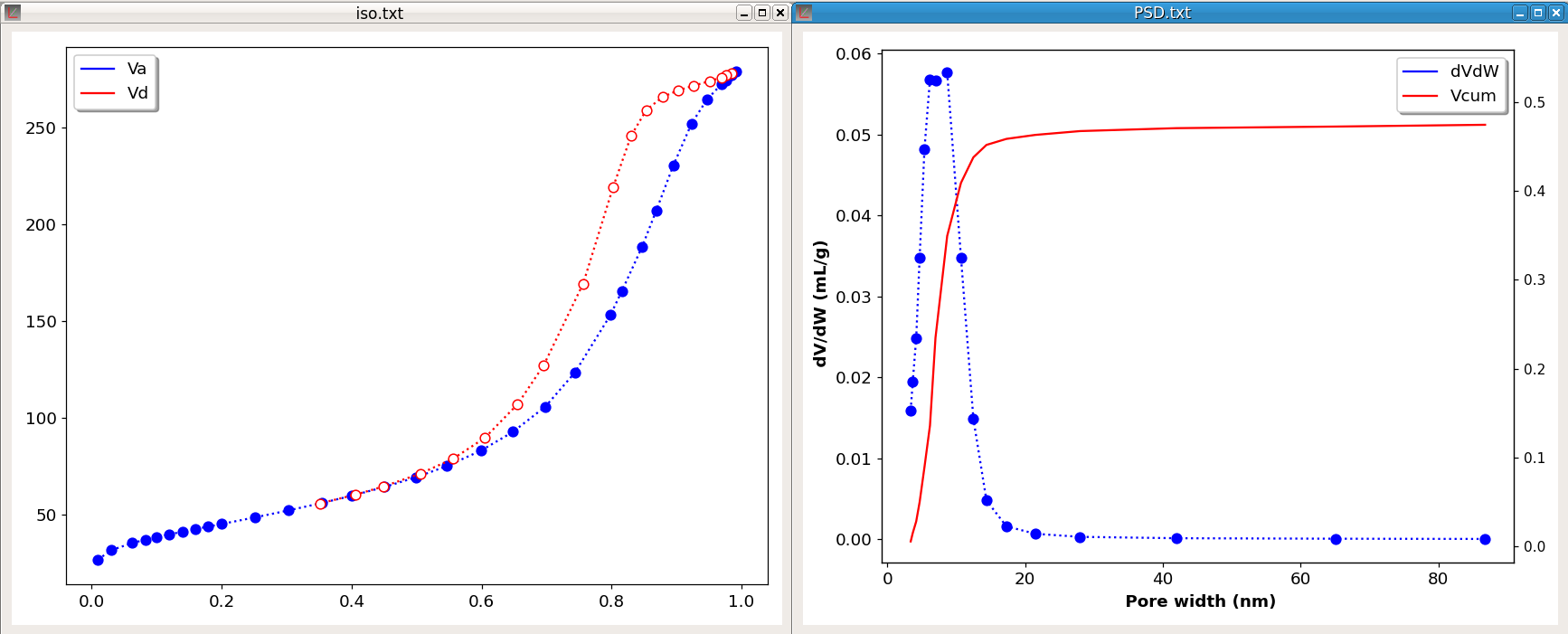
The command PSD computes the pore size distribution from adsorption-desorption isotherms. Two data block are required and it is assumed that the adsorption isotherm is contained in the first data block and the desorption isotherm in a second data block. Moreover, in these blocks, the first vector must contain the relative pressure and the second vector the adsorbed volume expressed in mL/g. Only nitrogen adsorption and cylindrical pore geometry are implemented.
The PSD command takes two parameters. The first, which can be either A or D, indicates which isotherm (A-dsorption or D-esorption) is used. The second parameter specifies the equation used for calculating the thickness of adsorbed layer according to the relative pressure (t-curve). This parameter can have one of the three values: halsey, harkins or tfit.
The figure 24 shows an example of the computation of a PSD. The left plot shows the adsorption-desorption isotherms. The computation was done with the desorption isotherm and halsey curve. At the end of the process a new file is generated which contains four vectors: the pore width (Wp), the pore volume (Vp), the pore volume divided by the pore width difference (dV/dW) and the cumulative pore volume (Vcum). As shown on the right chart, two curves are plotted, the pore size distribution dV/dW and the cumulative pore volume.
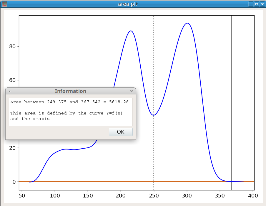
The command:
area Ycomputes the area under a curve Y=f(X) using the trapezoidal rule. The limits of the integration must be indicated by the marker positions. area is defined by the curve and the x-axis. Thus a baseline correction may be required before the area calculation. The figure 25 shows an example of the calculation of the area of the last peak. It should be noticed that, in the case of this picture, a better evaluation of the peak area could have been obtained with the Peak Fitting tool.
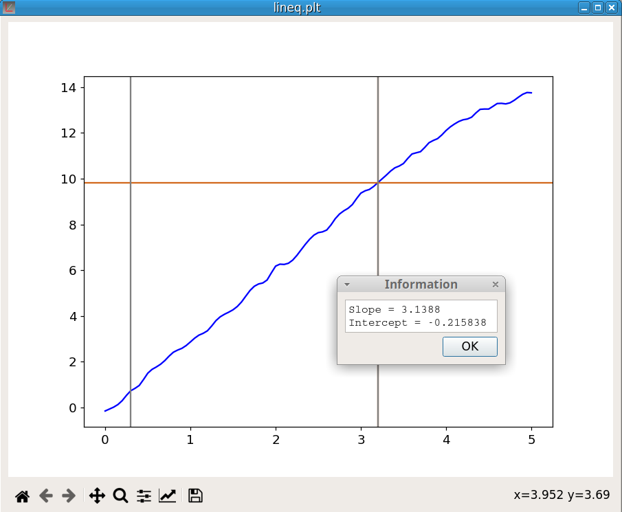
The command:
lineq YCompute the equation of the line linking the marker positions on the curve Y. The figure 26 shows an example of utilization.
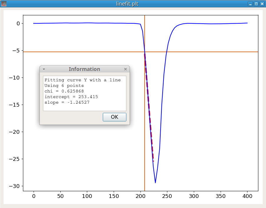
The command:
linefit Y 1Compute the equation of the line fitting the curve Y at the cursor position. The last parameter, which must be either -1 or +1, indicates the direction of the fitting line. The algorithm is:
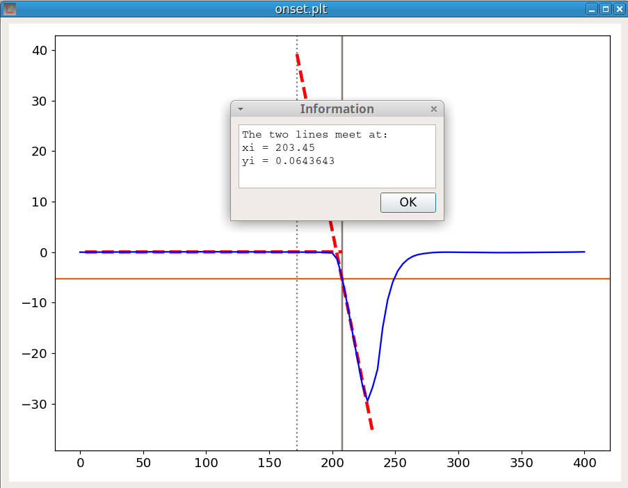
This command is used to determine the onset of a peak. The onset is an important feature of a peak. For example, in thermal analysis, the onset temperature does not depend on the heating rate unlike the temperature of the peak maximum.
Before using the onset command, both markers must be positioned to indicate the beginning and the approximate place of the inflection point at the base of the peak. The onset procedure makes use of the linefit function; indeed the process is:
The command is:
onset YThe figure 28 shows an example of the calculation.
The command to create a new vector V is:
newv Vname Vinit,Vend,stepsizwhere Vname is the vector name, Vinit is the first value, Vend is the last value and stepsiz is the difference between each value. A new data block is created to contain this new vector. For exemple the command:
newv X 0,9,1create a new data block containing the new vector X whose 10 elements are: 0,1,2,3,4,5,6,7,8,9
The command to delete the vector V is:
delv VThe command:
swapv V1 V2exchange all the elements between V1 and V2. This commande exchange only the values not the vector names.
The command to delete the data block number n is:
delb nThis delete all the vectors in the data block. Of course this will delete all the curves which used these vectors.
The syntax of the mergeb command is:
mergeb 1 2This command copies all the vectors of the block 2 at the end of the block 1 and then delete the block 2. Of course, the vectors must have the same number of elements in both blocks.
If V2 does not exist, a new variable is created. If V2 preexists, its previous content is lost.
The main mathematical functions can be applied to a vector (element-wise). The result is a vector with the same number of elements.
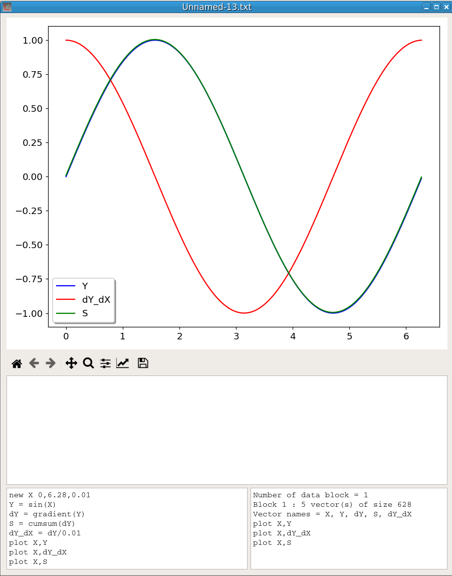
To illustrate gradient and cumsum functions, figure 29 shows the result of the execution of the following script sequence:
newv X 0,6.28,0.01
Y = sin(X)
dY = gradient(Y)
S = cumsum(dY)
dY_dX = dY/0.01
plot X,Y
plot X,dY_dX
plot X,S
Y is the sin(X) function. We see that Y and S curves (the cumsum of gradient) overlap almost perfectly (the shift decreases with dX). dY_dX is the gradient dY divided by dX, namely an approximation of the Y derivative, which is cos(X).
This command reduces the number of elements in a vector. It takes two parameters, the vector name and the reducing factor which must be in the range 2-10. This operation implies to reduce the number of elements of all the other vectors in the data block. For example, the command:
shrink V 4reduces in the number of elements in V by a factor 4.
This command:
revertv Vwill revert the order of elements in V. It takes only one parameter, the vector name.
This command:
revertb 1will revert the order of all the elements in a data block. It takes only one parameter, the data block number.
This command:
sort Vwill sort the elements of the vector V in ascending order. It takes only one parameter, the vector name. All the vectors belonging to the same data block will have the order of their elements changed but not necessarily sorted. To sort the vector elements in reverse order, first sort V then revert V.
This command:
IRabsconverts an IR spectrum in absorbance. It takes no parameter. It will generate an error if the first data block does not contain an IR spectrum in transmittance.
This command:
IRtransconverts an IR spectrum in transmittance. It takes no parameter. It will generate an error if the first data block does not contain an IR spectrum in absorbance.
This command :
fft Vcomputes the Discrete Fast Fourier Transform of a vector. It takes only one parameter, the vector name. The result of the conversion is saved in a file named as XXX-fft.txt where XXX is the vector name.
This command removes spikes in a vector. It takes two parameters, the vector name and the window size:
despike Vname winsiz The window size corresponds to the width of the spikes in number of points. It must be an odd number. Defaut size is 3. The figure 30 shows an example of use. The blue curve (I) is the original signal and the red curve shows the signal after using the command:
despike Ides 3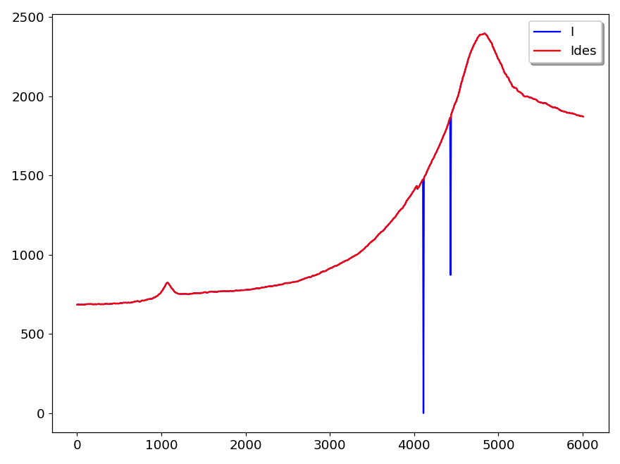
The command:
deldupx Xsorts X in ascending order and then removes duplicates. It processes only the data block containing the vector X. Moreover X must be the first vector of the data block. This command must be executed before using the Interpolation tool.
This command changes the precision (number of decimal places) of all the vector elements. For example the command:
ndec V 5set the precision of all elements of V to 5 decimal places
There are four commands for clipping. The commands for clipping along the y-axis are:
clipup vname maxval
clipdn vname minval
The first replaces in the vector vname all elements larger than maxval by maxval. The second replaces in the vector vname all elements lower than minval by minval.
The commands for clipping along the x-axis are:
clipx < minval
clipx > maxval
The first deletes in the vector vname all elements lower than minval. The second deletes in the vector vname all elements larger than maxval. It should be noted that clipping along y-axis does not change the number of points whereas clipping along x-axis decreases the number of points.
The figure 31 shows an example where the vector Yclip has been obtained by executing the command:
Yclip = Y
clipup Yclip 1
clipdn Yclip -1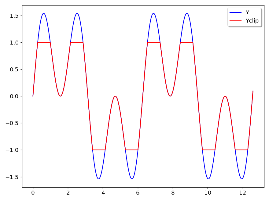
The line command joins, by a straight line, the points of a curve situated at the marker positions. This procedure does not delete the points between the markers but change their position.
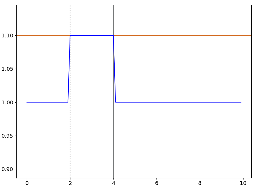
line YThe shift command shifts vertically the portion of a curve delimited by the markers. For example, the command:
shift Y 0.1add 0.1 to the points located between the marker positions. This is illustrated by figure 32.
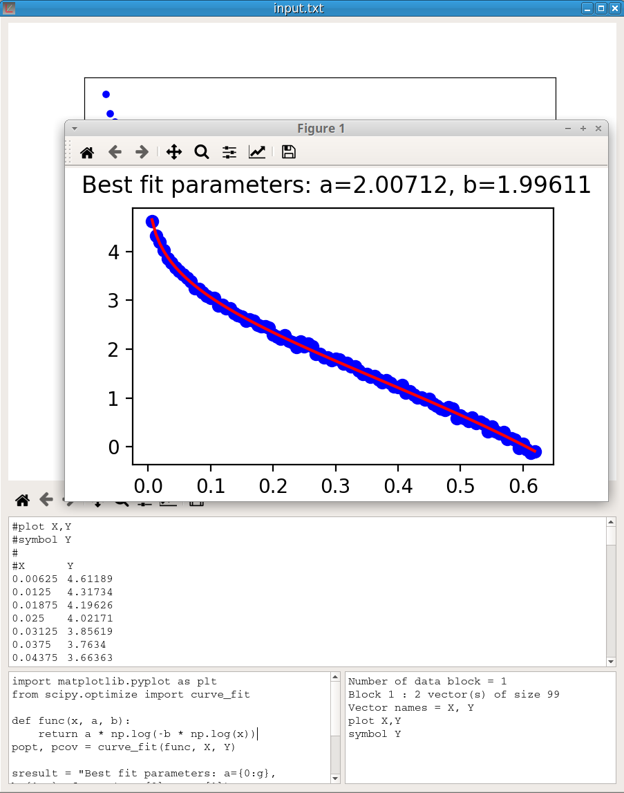
The Execute a Python script option in the Script menu executes the Python script in the Script window of the active pyDataVis window.
pyDataVis does several steps before the execution:
import numpy as np
A = np.loadtxt("input.txt")
X = A[0]
Y = A[1]
In this way, the vectors of the active curve can be accessed as X and Y. The output of the Python process is shown in the Information window and saved in the file “output.txt”.
An application of this option may be to use the powerful Scipy library to do some tasks not implemented in pyDataVis. Here is an example of a script using the curve_fit function in the scipy.optimize module to fit a user defined function to data.
import matplotlib.pyplot as plt
from scipy.optimize import curve_fit

def func(x, a, b):
    return a * np.log(-b * np.log(x))

popt, pcov = curve_fit(func, X, Y)

sresult = "Best fit parameters: a={0:g}, b={1:g}".format(popt[0], popt[1])
print (sresult)
plt.plot(X, Y, 'bo')
plt.plot(X, func(X, *popt), 'r-')
plt.suptitle(sresult)
plt.show()
The function used to fit the data is: \(Y = a \cdot log \left( -b \cdot log(X) \right)\)
The figure 33 shows the result of the script execution.